
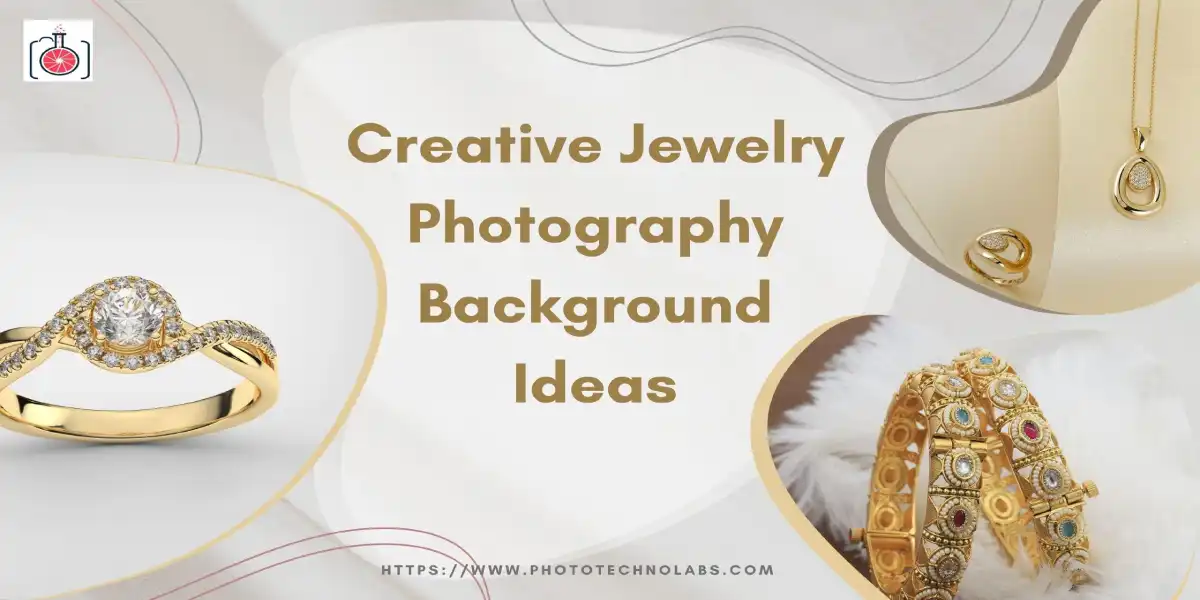
Confusing what creative jewelry photography background ideas is makes your jewelry products like rings, necklace, earrings, bracelet, and watches attractive. I have included 16 successful jewelry backgrounds which you can use for your online store to increase sales or use it for branding your products.
If you’re selling jewelry online today, I strongly suggest you rethink the habit of relying only on plain white backgrounds.
I’ve personally seen many stunning, high-quality jewelry pieces get ignored on Google, Instagram, and Amazon simply because the photos look identical to hundreds of others on the screen.
I advise you to consider that while white backgrounds were once the “safe” and professional standard, they now feel flat, boring, and predictable to modern buyers.
In 2026, shoppers are not just buying jewelry—they are buying emotion, luxury, and visual experience.
When your images look repetitive or clinical, people scroll past them without ever noticing the craftsmanship behind your pieces.
I also want to warn you that the wrong background can actually make your jewelry look cheaper than it truly is. If the setting does not complement the piece, gold can lose its warmth, diamonds can look less brilliant, and fine details can disappear.
That is why I recommend moving toward modern, conversion-focused jewelry photography background ideas designed for today’s visual trends.
These backgrounds help enhance sparkle, add depth, and tell a visual story that connects emotionally with buyers.
I’ve created this guide for Jewelry photography background ideas to help you—whether you are a jewelry brand owner or a photographer—build scroll-stopping visuals that attract attention, improve brand value, and turn casual browsers into confident buyers.
I strongly recommend that you treat your Jewelry photography backgrounds as a strategic branding tool, not just a surface behind your product.
In jewelry photography, the background directly shapes how premium your jewelry looks before anyone even reads the price or description.
First, background selection has a powerful impact on perceived luxury value. Soft textures, elegant colors, and clean compositions instantly make jewelry feel more expensive.
On the other hand, cluttered or mismatched jewelry background ideas can make even real gold and diamonds appear ordinary.
Background also plays a major role in building buyer trust.
When your photos look professional, consistent, and visually pleasing, shoppers feel confident that your brand is authentic and reliable.
Poor background choices create doubt and hesitation, which leads to abandoned carts and lost sales.
I also advise you to focus on click-through rates. Your product image is the first thing people see in Google results, Instagram feeds, and Amazon listings.
Most importantly, background directly influences conversion rates.
When your jewelry looks luxurious, emotionally appealing, and visually clear, buyers are more likely to complete their purchase instead of postponing or leaving your store.
You should also understand the importance of psychological color theory in jewelry photography.
Warm tones enhance gold richness, cool shades highlight diamonds, and soft pastels create calm, premium emotions.
The right colors silently guide buyer perception and purchasing decisions.
I strongly encourage you to stay updated with the latest trendy jewelry photography ideas 2026, because background styling is changing faster than ever before.
What worked even two years ago is already starting to look outdated on today’s social feeds and marketplaces.
One of the biggest changes you will notice is the rise of AI-styled minimal luxury backgrounds.
Many jewelry brands are now using AI-generated or digitally styled backgrounds that maintain perfect lighting, clean textures, and consistent branding across their entire catalog.
These best background for jewelry photography look modern, polished, and extremely professional while saving time and production costs.
- Provide perfectly balanced lighting and shadow control
- Keep branding consistent across hundreds of products
- Reduce reshoot and production costs
- Create a modern, editorial luxury appearance
You will also see a strong dominance of neutral and pastel aesthetics. Soft beige, ivory, blush, sage green, and powder blue tones are becoming the new luxury colors.
These shades make gold warmer, diamonds brighter, and gemstones more vibrant while creating calm, premium emotions that buyers love.
Finally, jewelry brands are now designing social-commerce-optimized backgrounds specifically for Instagram, Pinterest, and TikTok.
These backgrounds use clean negative space, lifestyle storytelling, and color harmony to make products look beautiful in vertical and square formats, helping brands gain more saves, shares, and direct sales.
In this section, I am sharing some of the most creative jewelry photography background ideas that are shaping premium online jewelry branding in 2026.
I strongly recommend using these styles if you want your images to look modern, emotionally engaging, and conversion-focused.
These modern jewelry photography backgrounds are designed to highlight sparkle, improve contrast, and match the best background color for jewelry photography based on product type and buyer psychology.
While you start a photography of jewelry you need to take care of creative photography in many angles, lighting, backgrounds, props, and camera everything. If you are beginner with jewelry photography so also need to start with your deep research that how to photograph jewelry.
The over goal to make it attractive, eye-catching and look real. So this will help to increase the sale and you can also share over the social media for the branding.
Before you start with jewelry photography and choose the right background you must clean the jewelry to look more attractive.
Below is a quick overview of the 16 background styles you will explore in detail:
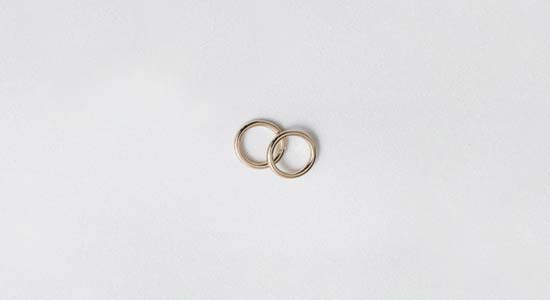
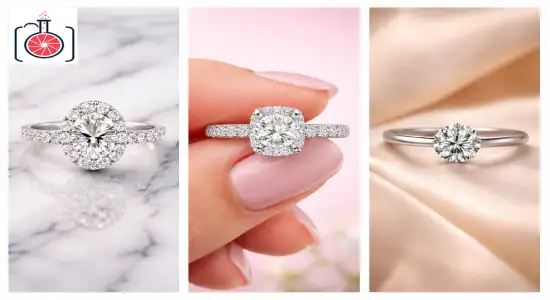
White background you can use for any jewelry photography. White background is easily available like you can use any white thick cloth or paper sheet for the same.
I strongly recommend using these styles if you want your images to look modern, emotionally engaging, and conversion-focused.
These modern jewelry photography backgrounds are designed to highlight sparkle, improve contrast, and match the best background color for jewelry photography based on product type and buyer psychology.
White background you can use for any jewelry photography. White background is easily available like you can use any white thick cloth or paper sheet for the same.
White background is very simple and you can start with basic photography with a low budget. With white background you don’t need to go through any other background process or need to find any other objects as well so it will save your time as well.
Below is a quick overview of the 16 background styles you will explore in detail:
Sometimes jewelry has many different parts with different colors. In this case you may not use other colors as buyers need to check from every angle and every part. So in this case if you are using color for a jewelry background it may confuse your buyers as well.
What really sets this apart from a basic white backdrop is the subtle play of shadows and textures. Instead of the piece floating in a void, it looks like it’s resting in a high-end studio.
These tiny tonal variations add an air of elegance and ensure that the fine details of your work don’t get lost in a sea of bright pixels.
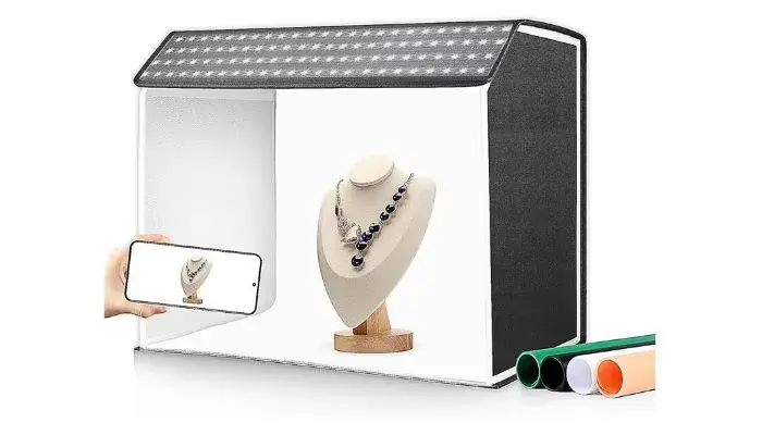
A light box is the great option for jewelry photography if you want to sell it online. There are a number of style and size light boxes available on amazon and you can choose one of the best light box for jewelry photography as per your needs.
The main advantages I’ve seen with this technique are much higher clarity and better sparkle visibility. Because you aren’t using competing colors, the viewer’s eye goes straight to the metal and stones.
I find this approach works perfectly for:
- Minimalist and everyday jewelry collections.
- Small earrings and dainty rings.
- Delicate pendants.
- Silver chains
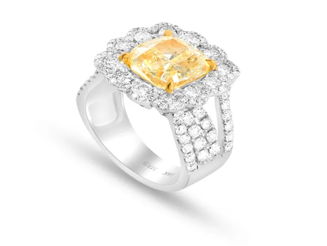
I’m a big fan of the black matte premium background when you want to create a bold, high-drama stage for your products.
Black jewelry background is eye-catching for the diamond jewelry and colorful stones. The black surface also gives you great reflection. You can normally find out black jewelry backgrounds with costly or most expensive jewelry.
By using a deep black, non-reflective surface, you’re essentially “turning off” the rest of the world so the jewelry can become the brightest and most eye-catching element in the frame.
I believe this approach is essential if you want to instantly elevate the perceived luxury of a piece.
There is something about the intense contrast of a matte black backdrop that makes gemstones sparkle with much more intensity.
It helps every fine detail—from the precision of a stone cut to the polish of the metal—pop with extreme clarity, which is exactly what you need to grab attention in a crowded online listing.
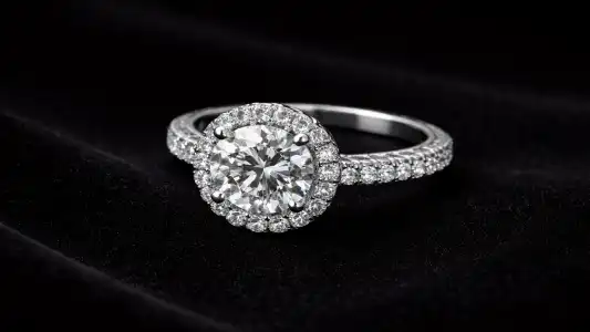
Black background easily you can get from stone or hardware stores. You can use a 50×50 cm block for jewelry background photography.
What really sets this apart from a glossy black or a dark-colored background is the non-reflective surface.
Because the matte material absorbs excess light rather than bouncing it back, you don’t have to worry about distracting glares or “ghost” reflections. All the focus stays exactly where it belongs: on the jewelry.
While you are using black background you need to make sure it should shine against the background like stone or glass. It will help to reflect or shadow the jewelry.
I find this approach works perfectly for:
- Diamond jewelry and platinum collections
- Gold rings and engagement pieces.
- Luxury bridal sets.
- High-value gemstone jewelry
Grey background nowadays for online stores and branding over social media. You can use light grey color as background only else it will not represent the jewelry.
You can use a grey background for gold or rose gold jewelry to reflect the best detail of each part. If you use like white gold or diamond kind of jewelry it will not look eye-catching and even not represent the details of the jewelry product photography.
Grey jewelry background normally is a bit famous and nowadays used as an option for black and white colors. For the grey background you can use the hard and thick papers hit or kind or stone or glass.
But with this kind of background you need to take care of reflection or shadow to look natural.
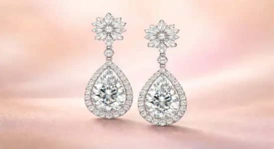
A soft pastel gradient background is one of the most elegant and modern jewelry photography backgrounds trending in 2026.
It uses gentle color transitions like blush pink to cream, lavender to ivory, or beige to powder blue to create a calm, premium visual feel around your jewelry.
I recommend this background because it makes jewelry look more refined and emotionally appealing.
Soft gradients naturally enhance sparkle, soften harsh contrast, and make gemstones appear brighter while keeping the focus clean and elegant—making them an ideal choice for a minimalist jewelry photography background.
Gradient, Patterns and texture Background is the good presenter for jewelry photography. With this kind of background you can use those kinds of backgrounds which make an attractive look of background and highlight your jewelry as well. Gradient, Patterns and texture Background you can also include pearls, charcoal or granite for many different shades.
What makes it different from flat solid-color backgrounds is its depth and smooth color flow.
This subtle variation adds a luxury editorial touch while still keeping the focus completely on your jewelry.
The main advantages include better visual balance, improved perceived value, and higher engagement on Instagram and Pinterest.
You can purchase this kind of background online as well at affordable rates. If you check online there are thousands of backgrounds available which you can choose and purchase. Moreover you can also visit the craft shop in the near area and purchase it at around 10 to 15$ per sheet.
Nowadays many companies are using their own branded theme background to create their own identity and brand on social media. For this kind of background companies design their own background digitally including logo and color.
While your graphic designing team is creating this type of background you should take care of light backgrounds which you can use for all kinds of jewelry.
You also need to take care that colors are from your logo from your brands only. This will help you to make your identity on online and social media platforms.
Bokeh background you can use as a jewelry background as well. With a bokeh background you can display or highlight the particular part of the jewelry.
You can use it for any kind of jewelry. It doesn’t matter if it is big or small. Even with this kind of jewelry background you don’t need to use any other materials as well.
Gold jewelry background is only popular in some countries and basically using for gold jewelry bradding like bangles or bracelets etc. I have seen that many big brands are using gold jewelry backgrounds for their expensive jewelry.
In this gold background you can use different shades of yellow or golden color according to your jewelry products and needs. With this kind of background you need to take care that the background represents your jewelry product properly and help buyers to make decisions.
Natural background will also give you an awesome look and you can use it as a jewelry background. You can use leaves, grass, flowers etc.
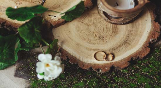
This will give your very creative and very natural look jewelry photography. Not only natural looks but it will also save your money and time as well. While you are using a natural background, jewelry makes your jewelry look creative and attractive.
You can also use sparkle jewelry backgrounds especially for the diamond jewelry. Diamond jewelry like wedding rings, necklace etc.

Diamond jewelry looks beautiful with a sparkle background but you can also use the colorful stones jewelry for the same. There are many types of sparkle background that you can use with different dark colors like black or green etc.
You can purchase the sparkle in many different colors from online stores or local craft shops and use it with a background for jewelry photography.
Graphite or black stone background normally used for very expensive jewelry by big brands.
With this kind of background you can photograph jewelry like necklaces or pearl jewelry most of the time. It looks natural and attracts the customer while they are looking for quite expensive jewelry.
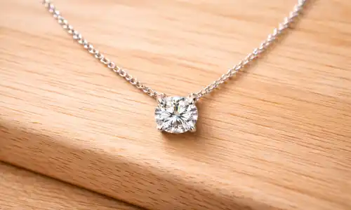
I strongly suggest using a sustainable wooden texture background if you want your brand to feel more grounded and authentic.
By using natural surfaces like bamboo, oak, pine, or even reclaimed timber, you create a warm, organic base that frames your jewelry beautifully.
The natural grain of the wood adds a bit of character to the shot without ever stealing the spotlight from the piece itself.
You can also use wood as a jewelry background. You can use wood to represent any jewelry that you want to sell or branding. But I have noticed that many photographers use it for rubric or red and blue.
I believe this unique background idea for jewelry photography is important because it’s a direct way to communicate your brand’s values.
In 2026, so many buyers are looking for jewelry that feels “handmade” or “eco-conscious.” When you use wood, you are visually telling the customer that your brand is responsible and cares about craftsmanship.
It’s an easy way to build an immediate sense of trust.
You can also use it for pearl jewelry or any other jewelry for the same with including some leaves, flowers to make it look attractive.
I find this approach works perfectly for:
- Handmade or artisan jewelry.
- Silver collections
- Boho-style pendants and rings.
- Ethically sourced or sustainable jewelry lines.
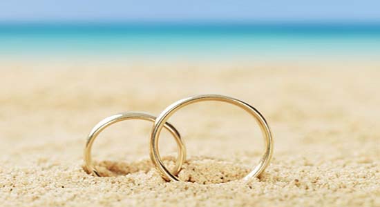
I suggest looking into sand and desert tone backgrounds if you want to give your jewelry a warm, organic, and high-end feel.
By using soft beige, tan, and earthy shades inspired by desert landscapes—think fine sand textures, matte clay, or smooth stones—you create a backdrop that feels incredibly calm and sophisticated.
I believe this choice is important because these earthy tones bring a sense of warmth and authenticity that you just can’t get from a standard studio color.
You can also use the marine kind of background for the jewelry photography. It will look very creative and different.
I have seen that you can use pearl jewelry photography with a marine theme background. You can set up the entire idea according to your need and start the photography.
These shades have a unique way of making gold look much richer and gemstones appear more vibrant.
It makes the entire image feel grounded, which really appeals to buyers who are drawn to natural or boho-inspired luxury.
What makes this stand out from a basic colored backdrop is the organic, “sun-kissed” texture.
For the same you can purchase required Martial from the local craft shops as well.
I find this approach works perfectly for:
- Boho and handmade collections.
- Turquoise jewelry
- Silver pendants and ethnic designs.
- Nature-inspired gemstone pieces.
Colorful background you can use while it’s a very different color than your jewelry color. For example if you are shooting colorful jewelry at that time you may use a light color background. If you will not make this kind of difference during the photography it will not attract the customers.
So while you are using a colourful background you need to take care of color according to jewelry.
Workshop background is used as a creative one background which will look different. You can use some small tools for jewelry making around the jewelry and make it very creative.
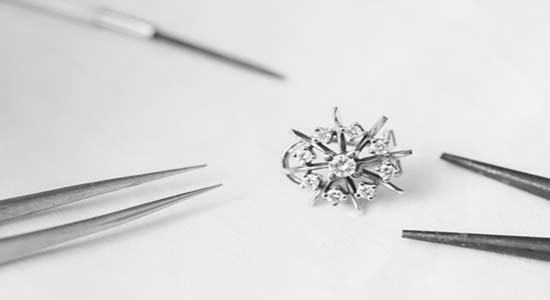
Customers will also feel that it looks like fresh made jewelry. Very few people are using this kind of setup as a jewelry background.
Create a flower as a jewelry background especially for the ceremony or wedding rings. Many jewelry photographers are using the red or pink roses for the special gifts or ceremony rings.
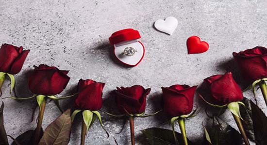
This kind of background looks very romantic and attractive to the buyers. It also helps them to make decisions very quickly. You can spray water or sparkle over the fresh roses and start to take pictures as well.
Book background looks simple and beautiful. You can use white page simple background instead of a colorful background like magazine pages.
For the Beginners this is the best option ever as it will save your time and money during the photography and it needs very minimum photo editing and photo retouching services as well.

So as beginners you don’t have to spend more time to find a background for jewelry photography. You can simply start with books available at home
Overall I have mentioned above 16 jewelry background ideas which you can use but at the end you can also create your own background different from these 16 ideas. A creative jewelry photography background ideas motto is to make jewelry photography look eye-catching and increase your sales.
You can also share it over social media to make it a small to big brand. You can use anything that you have handy to create an awesome jewelry background.
Choosing the right background is about much more than just picking something that “looks pretty.”
It actually dictates how premium your jewelry feels and how much confidence a buyer has when they hit that “purchase” button.
To make things easier, I’ve put together some practical advice on how to match specific backgrounds with different types of jewelry.
To make things easier, I’ve put together some practical advice on how to match specific backgrounds with different types of jewelry.
Rings are small but packed with tiny details, so you need a background that highlights the sparkle and shape without any distractions.
I’ve found that clean, high-contrast options—like matte black, soft pastel gradients, or marble—work best.
These keep the viewer’s focus entirely on the stone cut, the prongs, and the shine of the metal.
I also highly recommend lifestyle shots on a hand; they are incredibly effective for showing scale and building immediate trust.
Since necklaces are all about length and flow, they need backgrounds that support those natural curves.
I suggest using neutral fabric folds, velvet, or marble textures. These surfaces prevent harsh shadows from breaking up the image and make the chain look smooth and elegant.
A quick tip: avoid busy patterns here, as they tend to “cut off” the natural line of the necklace and make the photo feel cluttered.
Earrings really benefit from light, clean backgrounds that emphasize their symmetry.
I’ve seen great results with white-on-white minimal styles, acrylic sheets, and floral flat lays.
Because it’s often hard to judge how big an earring is just by looking at it, I also advise including a lifestyle shot on a model. It helps customers visualize the drop length and how the piece actually sits.
I generally follow two different paths here based on the “vibe” of the collection:
- For Bridal Jewelry: You want to communicate high-end value and tradition. Stick with luxury-focused backgrounds like velvet, marble, matte black, or mirror reflections. These say “premium” louder than anything else.
- For Fashion Jewelry: You have more room to be playful. I recommend color blocks, floral flat lays, and pastel gradients. These feel trendy, youthful, and are much more likely to get noticed on social media.
The best background in the world won’t look its best unless your lighting and camera settings are in total harmony with it.
I always suggest treating your technical setup as part of your overall styling strategy, rather than just a chore to get through.
If you are working with light backgrounds—like white, pastels, or marble—I recommend using soft, diffused lighting.
This helps you avoid those harsh shadows and “blown-out” white spots that ruin a clean look. A great trick is to use two softbox lights at 45-degree angles with a reflector in front to gently fill in any remaining shadows.
I’ve noticed that shooting from slightly above—at a 30° to 45° angle—tends to capture depth and brilliance more naturally than a flat, eye-level shot.
Of course, you should save the “top-down” flat lay style for your lifestyle and floral shots, while keeping the straight-on angles for your more formal Amazon and catalog listings.
To get the most out of these angles, I advise using a camera with manual controls so you can fine-tune your exposure, ISO, and aperture.
If you can, pair it with a macro lens. It’s the only way to really capture those tiny details like prong settings and the inner clarity of a gemstone.
Using the Best Camera for jewelry photography with manual control allows you to fine-tune exposure, ISO, and aperture for sharper images.
Pair it with the Best Lens for jewelry photography, preferably a macro lens, to capture fine details, prong settings, and gemstone clarity.
Finally, don’t forget to adjust your white balance based on the background you’ve chosen.
Warm backgrounds often need a slightly cooler white balance setting, while cool-toned backgrounds might need a warmer adjustment. This ensures that your gold, silver, and stones look natural and true-to-life in the final photo.
I really have to emphasize that even the most stunning background and perfect lighting can’t hide the tiny flaws that inevitably show up in raw jewelry photos.
That’s why I suggest treating post-production jewelry retouching services as a non-negotiable part of your process, rather than an optional last step.
For starters, dust removal is absolutely crucial. Tiny particles, fingerprints, or even a stray fabric fiber from your background might be invisible to your naked eye while shooting, but they become glaringly obvious on a high-resolution smartphone or laptop screen.
Taking the time to clean up these images instantly makes your brand feel more premium and trustworthy.
I also recommend focusing on reflection correction. Jewelry is inherently reflective, and retouching helps you control those distracting glares on metal and stones.
The goal here is to balance the shine so the piece looks brilliant but still natural and appealing to the eye.
Color correction is another area where I advise you to be extra careful. You want to make sure your yellow gold looks warm, your white gold stays neutral, and your gemstone colors are 100% accurate. This isn’t just about aesthetics—it protects you from color-related returns and unhappy customers who feel the product didn’t match the photo.
I’d like to share a real-world example that perfectly illustrates just how much of a difference the right background can make.
I recently followed a mid-size jewelry brand that was sticking strictly to plain white backgrounds for everything. Their craftsmanship was actually top-tier, but because their photos were so “safe” and clinical, they looked exactly like every other competitor on Google and Amazon.
They were getting plenty of traffic, but people weren’t sticking around—their conversion rates were low, and their social media posts were barely getting any traction.
They decided to pivot and upgrade their entire visual strategy. They started using marble stone, soft pastel gradients, and lifestyle hand backgrounds.
They decided to pivot and upgrade their entire visual strategy. They started using marble stone, soft pastel gradients, and lifestyle hand backgrounds.
The results were incredible. Within just two months, their website conversion rate jumped by over 30%.
On Instagram, their posts started getting nearly double the usual amount of saves and shares. Customers were actually spending more time on the product pages because the jewelry finally looked as premium as it felt in real life.
It’s a perfect example of how a simple background upgrade can transform casual browsers into confident, paying buyers.
Jewelry photography in 2026 is no longer just about placing your product on a plain surface and clicking a picture.
Modern trends clearly show a shift toward pastel luxury tones, natural textures, lifestyle storytelling, AI-generated backgrounds, and emotionally engaging visuals that help brands stand out in crowded digital marketplaces.
My final recommendation is simple — choose backgrounds that reflect your brand personality and the type of jewelry you sell, not just what feels “safe.”
The right background can dramatically improve how premium your jewelry looks, how much attention it receives, and how confident buyers feel while making a purchase.
I also encourage you to invest in professional retouching and maintain consistent branding across your entire catalog.
Clean, color-accurate, and visually consistent images build trust, strengthen your brand identity, and quietly increase conversions over time.
When your backgrounds, lighting, and retouching work together, your jewelry does more than look beautiful — it starts selling itself.
I really don’t think there is a “one-size-fits-all” background for every brand, but if you’re looking for a place to start, soft pastel gradients, marble stone, matte black, and white-on-white minimal styles are definitely among the most effective.
In my experience, these specific options do the best job of highlighting a piece’s sparkle and improving overall clarity. They create that high-end, premium feel that makes a buyer feel confident in their purchase.
In my experience, backgrounds that lean into emotional connection and a sense of luxury almost always outperform the rest. I’ve consistently seen that marble textures, velvet fabrics, lifestyle hand shots, and soft pastel gradients lead to much higher conversion rates than a standard, plain white backdrop ever could.
I’ve found that lifestyle backgrounds almost always perform better on social media and brand websites because they actually show the jewelry in its natural element. It’s much easier for a buyer to fall in love with a piece when they can visualize themselves wearing it.
While plain white backgrounds are still a “must-have” for meeting marketplace requirements, it’s the lifestyle images that really drive engagement and get people talking about your brand.
I’ve found that you can definitely use AI-generated backgrounds, provided they stay within Amazon’s specific image guidelines. They are actually a fantastic tool for keeping your branding consistent, especially when you’re managing a large catalog and need everything to look uniform.
I really believe that sticking to three to five consistent background styles is the sweet spot. It gives you enough room for creative variety so your feed doesn’t feel repetitive, but it still keeps your brand looking unified and professional.
I’ve noticed that matching your background color to your metal type makes a world of difference. For gold pieces, I find that warm beige, blush, and cream tones really enhance that natural glow.
If you’re shooting silver, cool grays, crisp whites, or even a soft pastel blue tend to work best. And when it comes to diamonds, nothing makes them sparkle quite like a high-contrast backdrop—think black, charcoal, or marble.

Ron Jonas
About Author
Hi there, I’m Ronald Jonas – A photography specialist, Blogger. Portland, Oregon Area, USA.


